I bought a Dell with Vista on it a few months ago. I figured that it was high time that I upgraded to Microsoft's newfangled operating system. It hasn't been too bad. There are some hiccups, but every complex piece of software has its share of those. I'm sure Microsoft will try its hardest to fix those with time.
On the other hand, Aero is pretty much terrible. Sure, it's pretty (at least at first). My impression is that the rendering infrastructure is also quite good. But holy cow, Microsoft needs to hire some actual UI designers. Not just artists, but people who understand user interfaces. There are some reasonably amateurish mistakes in Aero. Even if they seemed like good ideas at the time, after using Vista for about a week, you really start to notice them.
I was first surprised to see how mousovers have invaded Explorer. Look at the following picture. Which icon is selected, and which icon am I pointing my mouse at? Can you believe that it's easy to delete the wrong file?
The new, unified look for the windows isn't too bad. The window titlebars are translucent, with a frosted glass appearance. At first I though that the effect would be distracting. You know what, I was right.
Explorer windows look a little bare, but the whole top of the window is available for your dragging pleasure. Well, almost all of it. If you manage to click in the upper-left of the window's title-less-bar, you get your friendly system menu.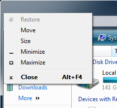
Finally, my absolute least favorite thing. For whatever reason, the rollovers that cause me to shred the wrong file have also made it into the standard tree control. Here, when your mouse leaves the tree control's bounds, the tree "fades away..." It literally disappears. Which can leave the following unfortunate situation:
Wait, I think maybe there's a bit more to it...
Ah, I bet we can expand that.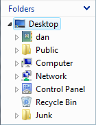
There we go!
Now, you might be asking yourself "who cares?" It doesn't seem like it's that big of a problem. True, in Explorer, the only inconvenience is that I don't know at a glance if my folder contains any items. It's a problem, but not a huge one. So, let's take a look at the Java programmer's friend, Eclipse.
Search results, you say. Search results, indeed. And people are trying to emulate it! Little hint: just because Microsoft does it, doesn't mean it's a good idea.
Even the Windows Classic theme isn't safe. The "expandos" in the classic TreeView fade out too.
If only Microsoft supported third-party themes... oh wait, you need to replace system DLLs to do that. Still, I don't know if I can stand the horrible usability of the stock UI. Hey Microsoft: ever wonder why so many themes and theming tools exist for your platform? I can think of a reason.
Even with all my bitching, I think Microsoft's heart was in the right place here. They realized that they needed a better rendering infrastructure (with features like compositing on the video card) and a more slick UI. Apple had been stealing the show on this issue for the past seven twenty-three years. Microsoft needs to go back to the drawing board. They need a fresher UI in the next version of Windows. And they need fewer people working on it. I think Windows is going to buckle under its own weight within 10 years. Apple continues to embellish their own UI, but it's often both functional and pretty. That's why people go ga-ga over it. Expose is a great demo, but I use it daily. Same with Dashboard.
I can only imagine what it must have been like to have seen this live:
... especially when this is what people were used to...
No comments:
Post a Comment